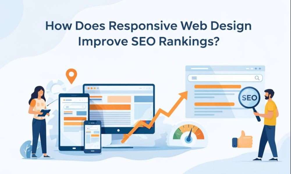
In today’s digital-first world, having a visually appealing website is no longer enough. Your website must perform seamlessly across all devices; desktops, tablets, and smartphones; to stay competitive. This is where Responsive Web Design (RWD) plays a crucial role. Beyond enhancing user experience, responsive web design has a direct and significant impact on SEO rankings.
Search engines like Google prioritize websites that deliver consistent, fast, and user-friendly experiences. In this blog, we’ll explore what responsive web design is, how it works, and why it’s essential for improving SEO rankings.
What Is Responsive Web Design?
Responsive Web Design is a web development approach where a website’s layout, content, images, and functionality automatically adapt to different screen sizes and devices. Instead of creating separate websites for desktop and mobile users, a single responsive website adjusts itself dynamically using:
- Flexible grids and layouts
- Scalable images
- CSS media queries
This ensures users get an optimal browsing experience regardless of the device they use.
Why Google Prefers Responsive Websites?
Google has clearly stated that user experience directly influences search rankings. Since 2015, Google’s mobile-friendly update and later the Mobile-First Indexing policy confirm that Google primarily uses the mobile version of a website for indexing and ranking.
Responsive design aligns perfectly with Google’s guidelines because it:
- Uses a single URL for all devices
- Avoids duplicate content issues
- Makes crawling and indexing easier for search engines
How Responsive Web Design Improves SEO Rankings?
Let’s break down the key ways responsive web design positively impacts SEO.
1. Mobile-First Indexing Advantage
Google primarily indexes and ranks websites using their mobile version. If your site is not mobile-friendly, your rankings can suffer, even for desktop searches.
Responsive web design ensures:
- Content consistency across devices
- No missing text, images, or links on mobile
- Better crawlability by search engine bots
A responsive website meets Google’s mobile-first requirements, leading to higher visibility in search results.
2. Improved User Experience (UX)
User experience is at the heart of SEO. Metrics such as bounce rate, dwell time, and pages per session directly influence rankings.
Responsive design improves UX by:
- Eliminating horizontal scrolling
- Making text readable without zooming
- Ensuring buttons and links are easy to tap
- Maintaining consistent navigation
When users enjoy browsing your site, they stay longer, sending positive engagement signals to Google, which boosts rankings.
3. Faster Page Load Speed
Page speed is an officially recognized ranking factor for desktop and mobile search results. A well-implemented responsive website loads faster because:
- It avoids unnecessary redirects
- Uses optimized images for different screen sizes
- Eliminates separate mobile URLs (m.example.com)
Faster websites lead to:
- Lower bounce rates
- Higher conversion rates
- Better search engine rankings
Google’s Core Web Vitals heavily emphasize loading performance, which responsive design supports effectively.
4. Lower Bounce Rate
Bounce rate measures how many users leave your website without interacting further. Non-responsive websites often frustrate mobile users, causing them to leave immediately.
Responsive design helps by:
- Delivering device-optimized layouts
- Ensuring smooth navigation
- Improving readability and usability
A lower bounce rate indicates content relevance and usability; both strong signals for better SEO rankings.
5. Single URL Structure (No Duplicate Content)
One of the biggest SEO benefits of responsive web design is the single URL approach. Instead of maintaining separate desktop and mobile websites, responsive sites use one URL for all devices.
SEO benefits include:
- No duplicate content penalties
- Easier link-building and backlink consolidation
- Simplified analytics and tracking
All SEO authority, backlinks, and social shares point to a single URL, strengthening domain authority and ranking power.
6. Better Crawl Efficiency
Search engine bots have a crawl budget; meaning they can only crawl a limited number of pages per visit. Responsive websites make crawling more efficient because:
- Only one version of each page exists
- No need to crawl separate mobile and desktop pages
- Cleaner site architecture
This allows search engines to index your site faster and more accurately, improving overall SEO performance.
7. Enhanced Local SEO Performance
Most local searches are conducted on mobile devices, such as:
- “Web designer near me”
- “Digital marketing company nearby”
- Responsive design enhances local SEO by:
- Improving mobile usability for local visitors
- Supporting click-to-call and map integrations
- Increasing mobile engagement
This is especially important for businesses targeting specific cities or regions.
8. Improved Social Sharing and Traffic
Social media traffic largely comes from mobile devices. A responsive website ensures that users clicking your shared links experience a seamless interface.
Benefits include:
- Higher engagement from social traffic
- Increased time on site
- Lower bounce rates
All these factors indirectly contribute to improved SEO rankings.
9. Higher Conversion Rates
While conversions are not a direct ranking factor, they strongly influence user behavior metrics. Responsive design improves conversions by:
- Offering consistent CTAs across devices
- Simplifying forms and checkout processes
- Enhancing trust and credibility
Better engagement and satisfaction lead to stronger SEO signals.
10. Future-Proof SEO Strategy
Responsive web design is adaptable to new devices and screen sizes, such as foldable phones and large tablets. This makes your website future-ready without frequent redesigns.
Search engines favor websites that:
- Stay updated with modern standards
- Provide consistent experiences
- Follow best practices
- Responsive design ensures long-term SEO stability.
Responsive Web Design vs. Separate Mobile Website
| Feature | Responsive Design | Separate Mobile Site |
|---|---|---|
| SEO Friendly | Yes | Risk of duplication |
| URL Structure | Single URL | Multiple URLs |
| Maintenance | Easy | Complex |
| Page Speed | Optimized | Often slower |
| Google Recommendation | Yes | No |
Google officially recommends responsive web design over separate mobile sites.
Best Practices to Maximize SEO with Responsive Design
To fully leverage responsive design for SEO, follow these best practices:
- Use mobile-friendly fonts and button sizes
- Optimize images with responsive formats
- Test pages with Google Mobile-Friendly Test
- Improve Core Web Vitals (LCP, CLS, INP)
- Ensure consistent content across devices
- Avoid intrusive pop-ups on mobile
Digi Enter
Digi Enter offers professional responsive website designing services in Delhi, helping businesses create fast, user-friendly, and SEO-optimized websites. Our designs adapt seamlessly across desktops, tablets, and mobile devices to deliver an exceptional user experience.
We focus on modern layouts, clean code, and mobile-first design principles to improve engagement, reduce bounce rates, and boost search rankings.
Whether you need a business website, landing page, or eCommerce platform, our expert team ensures your website looks great and performs flawlessly on every screen. Partner with Digi Enter to build a responsive website that drives traffic, leads, and long-term growth.
Final Thoughts
Responsive web design is no longer optional; it’s a core SEO requirement. From mobile-first indexing and improved user experience to faster page speed and better crawlability, responsive design directly impacts search engine rankings.
If you want to:
- Rank higher on Google
- Improve user engagement
- Increase conversions
- Build long-term SEO success
Then investing in responsive web design is essential.
A responsive website doesn’t just look good, it performs better, ranks higher, and converts more.
Don't Miss: What is the 70/20/10 Rule in Digital Marketing?


